


こんにちは、カヨです。
SEとしてお仕事しています。
会社に所属しており、以前からのプロジェクトを引き継いだり、
使われてなかったサイトが発掘され変更依頼を突然されたり
日々WEBサイトの修正をしています。
今回のお題は、
会社に所属してから既存のWEBサイトを触ることがほとんどなのですが、最近デザインの土台からHPを変更して欲しい依頼が多く大量のページに適応している共通CSSが全然共通してこなくなったので、どんなサイトでもこれだけは必要なCSSになるのではという部分を抜粋&記録しておこうと思い立った。
あれ?サイトのデザインをフォーマット化して今後の変更を楽にするんじゃなかったの??と言いたいところだが誰も聞いてはくれないのがシステムと関係ない会社の特徴である。
✔︎WEBサイトを作成してる人
✔︎CSS・SCSS勉強し始めた人
✔︎リセットCSSどうしようか悩んでる人
✔︎フロントエンドのコードかいてる人
ファイル構造
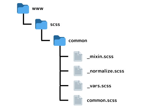
commonファイルをそのままいろんなプロジェクトに使用できるようになっています。実際、最下層の4つのファイル以外にもbootstrapとfontawesomeのフォルダ2つがありましたしたがここでは省きます。記載してない2つもここに設置する場合はダウンロード形式で同階層に設置すしてください。
コード
common.scss
@charset "UTF-8";


//****************************************
// common.scss
//****************************************
//
// INDEX
//
// --------------------------------------
// @import
// --------------------------------------
// 基本設定
// --------------------------------------
// PRECSS:レイアウト(.__ly)
// --------------------------------------
// PRECSS:ブロック(.__bl)
// --------------------------------------
// PRECSS:エレメント(.__el)
// --------------------------------------


// --------------------------------------
// @import
// --------------------------------------
@import "vars";
@import "mixin";
@import "normalize";
@import url("https://fonts.googleapis.com/css2?family=Sawarabi+Gothic&display=swap");
@import url("https://fonts.googleapis.com/css2?family=Sawarabi+Mincho&display=swap");


// --------------------------------------
// 基本設定
// --------------------------------------
* {
  box-sizing: border-box;
}


html {
  font-size: 62.5%;
  line-height: $line-h-base;
}


body {
  color: $fc-base;
  font-family: "Sawarabi Gothic", "游ゴシック", "YuGothic",
    "ヒラギノ角ゴ ProN W3", "Hiragino Kaku Gothic ProN", "メイリオ", "Meiryo",
    sans-serif;
  position: relative;


  @include media-query(pc) {
    font-size: $ft-pc;
  }


  @include media-query(tab) {
    font-size: $ft-tab;
  }


  @include media-query(sp) {
    font-size: $ft-sp;
  }


  // font-size:スクリーンの大きさで変動するクラス。
  .font-size-browser-width {
    @each $device,
    $value in $standard-sizes {
      @include media-query($device) {
        @include fontsize(18, $value);
      }
    }
  }


  &.rakuten {
    font-size: $ft-pc !important;
  }
}


.body-wrap {
  overflow: hidden;
}


img {
  max-width: 100%;
  height: auto;
  vertical-align: bottom;
}


.sp {
  @include media-query(tab-pc) {
    display: none;
  }
}


.sp-tab {
  @include media-query(pc) {
    display: none;
  }
}


.tab {
  @include media-query(sp) {
    display: none;
  }


  @include media-query(pc) {
    display: none;
  }
}


.tab-pc {
  @include media-query(sp) {
    display: none;
  }
}


.pc {
  @include media-query(sp-tab) {
    display: none;
  }
}


// --------------------------------------
// PRECSS:レイアウト(.__ly)
// --------------------------------------
// レイアウト非表示クラス(SEOに反映させる)
.ly__hidden {
  position: absolute;
  z-index: -1000;
  width: 1px;
  height: 1px;
  padding: 0;
  margin: 0;
  overflow: hidden;
  clip: rect(1px, 1px, 1px, 1px);
  white-space: nowrap;
}


// 上下左右中央
.ly__pos-center {
  @include pos-center();
}


// コンテンツをラップするとき
// 背景画像やイラストなどがスクリーンからはみ出すのを防ぐ
.ly__wrapper {
  @include media-query(sp-tab) {
    overflow: hidden;
  }
}


// 基本のコンテンツ
.ly__con {
  // background: $white;
  width: 100%;
  max-width: $w-con;
  margin: 0 auto;
}


.ly__con-rakuten {
  background: $white;
  width: $w-con-rakuten;
  margin: 0 auto;
}


// 基本のコンテンツ:背景なし
.ly__con-transparent {
  width: 100%;
  max-width: $w-con;
  margin: 0 auto;
}


.ly__con-rakuten-transparent {
  width: $w-con-rakuten;
  margin: 0 auto;
}


// 背景重なりのとき前に出したいコンテンツに適用
.ly__con-zindex {
  @include media-query(tab-pc) {
    position: relative;
    z-index: 1;
  }
}


// コンテンツのインデントを設定(padding)
.ly__con-padding {
  @include side-spacer(padding);
}


// コンテンツのインデントを設定:×2(padding)
.ly__con-padding-double {
  @include side-spacer-double(padding);
}


// コンテンツのインデントを設定:×3(padding)
.ly__con-padding-triple {
  @include side-spacer-triple(padding);
}


// コンテンツのインデントを設定(margin)
.ly__con-margin {
  @include side-spacer(margin);
}


// コンテンツのインデントを設定:×2(margin)
.ly__con-margin-double {
  @include side-spacer-double(margin);
}


// コンテンツのインデントを設定:×3(margin)
.ly__con-margin-triple {
  @include side-spacer-triple(margin);
}


// --------------------------------------
// PRECSS:ブロック(.__bl)
// --------------------------------------
// パラグラフ
.bl__paragraph {
  @include line-h-prg();
}


.bl__paragraph-wider {
  @include line-h-wide();
}


// ボーダー囲いコンテンツ
.bl__border-box {
  border: solid 1px $fc-base;
  padding: 1em;
}


// ボタン:角丸
.bl__btn-bar-kadomaru {
  @include btn-bar-kadomaru($display: block, $bg-color: $gray, $color: $white);
  min-width: 250px;
}


// ボタン:四角
.bl__btn-rec {
  @include btn-rec($bg: $fc-base, $pdg: 0.7em 1em, $clr: $white);
  min-width: 250px;
}


// ボタン:四角ボーダー
.bl__btn-rec-border {
  @include btn-rec-border($border: $fc-base, $pdg: 0.7em 1em);
  min-width: 250px;
}


// --------------------------------------
// PRECSS:エレメント(.__el)
// --------------------------------------
// ホバーで透過
.el__ho-link {
  @include css-animation();


  &:hover {
    opacity: 0.6;
  }
}


// 注意書き(赤色)
.el__txt-caution {
  color: $red;
}


// フォントサイズ:少し小さい
.el__font-smaller {
  font-size: 90%;
}


// フォントサイズ:少し大きい
.el__font-bigger {
  font-size: 125%;
}


.el__font-mincho {
  @include font-mincho();
}


.el__line-h-wide {
  line-height: $line-h-wide;
}


// リンクテキスト
.el__link-txt {
  color: $fc-base;
  text-decoration: none;


  &:hover,
  &:focus {
    color: $fc-base;
  }
}
このファイルに他の_(アンダーバー)月のファイルをインポートさせています。
_normalize.scss
/*! normalize.css v8.0.1 | MIT License | github.com/necolas/normalize.css */html{line-height:1.15;-webkit-text-size-adjust:100%}body{margin:0}main{display:block}h1{font-size:2em;margin:.67em 0}hr{box-sizing:content-box;height:0;overflow:visible}pre{font-family:monospace,monospace;font-size:1em}a{background-color:transparent}abbr[title]{border-bottom:none;text-decoration:underline;text-decoration:underline dotted}b,strong{font-weight:bolder}code,kbd,samp{font-family:monospace,monospace;font-size:1em}small{font-size:80%}sub,sup{font-size:75%;line-height:0;position:relative;vertical-align:baseline}sub{bottom:-.25em}sup{top:-.5em}img{border-style:none}button,input,optgroup,select,textarea{font-family:inherit;font-size:100%;line-height:1.15;margin:0}button,input{overflow:visible}button,select{text-transform:none}[type=button],[type=reset],[type=submit],button{-webkit-appearance:button}[type=button]::-moz-focus-inner,[type=reset]::-moz-focus-inner,[type=submit]::-moz-focus-inner,button::-moz-focus-inner{border-style:none;padding:0}[type=button]:-moz-focusring,[type=reset]:-moz-focusring,[type=submit]:-moz-focusring,button:-moz-focusring{outline:1px dotted ButtonText}fieldset{padding:.35em .75em .625em}legend{box-sizing:border-box;color:inherit;display:table;max-width:100%;padding:0;white-space:normal}progress{vertical-align:baseline}textarea{overflow:auto}[type=checkbox],[type=radio]{box-sizing:border-box;padding:0}[type=number]::-webkit-inner-spin-button,[type=number]::-webkit-outer-spin-button{height:auto}[type=search]{-webkit-appearance:textfield;outline-offset:-2px}[type=search]::-webkit-search-decoration{-webkit-appearance:none}::-webkit-file-upload-button{-webkit-appearance:button;font:inherit}details{display:block}summary{display:list-item}template{display:none}[hidden]{display:none}
/*# sourceMappingURL=normalize.min.css.map */
https://github.com/necolas/normalize.cssここから公式の内容をダウンロードできる。しかし、今回記述しているのはこの公式の中の一部。リセットcssと呼ばれる各ブラウザのcssを一度リセットしてくれ。様々なブラウザで見るとそのたび少しずつ別のCSSが効いて見え方が変わってしまうことがあるのでこのリセットが必要。調べると様々なリセットCSSが出てくる。
_mixin.scss
@charset "UTF-8";


//****************************************
// mixin.scss
//****************************************
//
// INDEX
//
// --------------------------------------
// デバイス幅による設定
// --------------------------------------
// フォント
// --------------------------------------
// テキスト
// --------------------------------------
// コンテンツレイアウト
// --------------------------------------
// アニメーション
// --------------------------------------
// リセット
// --------------------------------------
// ボタン
// --------------------------------------


// --------------------------------------
// デバイス幅による設定
// --------------------------------------
// デスクトップ・タブレット・スマホの css 切り替え
@mixin media-query($media: sp) {
  @media #{map-get($screen-sizes, $media)} {
    @content;
  }
}


// display:none(デバイス幅毎に)
@mixin display-none($screen-size) {
  @include media-query($screen-size) {
    display: none;
  }
}


// --------------------------------------
// フォント
// --------------------------------------
@mixin font-mincho() {
  font-family: 'Sawarabi Mincho', sans-serif;
}


@mixin font-gothic() {
  font-family: 'Sawarabi Gothic', sans-serif;
}


@mixin fontAwesome-solid($icon:"\f118") {
  content: "#{$icon}";
  font-family: "Font Awesome 5 Free";
  font-weight: 900;
}


@mixin fontAwesome-brands($icon:"\f41e") {
  content: "#{$icon}";
  font-family: "Font Awesome 5 Brands";
  font-weight: 400;
}


// --------------------------------------
// テキスト
// --------------------------------------
@mixin txt-shadow($blur:15px, $clr:$black) {
  text-shadow: 0 0px $blur rgba($clr, 0.5);
}


@mixin line-h-prg() {
  line-height: $line-h-prg;
}


@mixin line-h-wide() {
  line-height: $line-h-wide;
}


// --------------------------------------
// コンテンツレイアウト
// --------------------------------------
// content
// 基本のコンテンツ、.ly__conと同じ
@mixin basic-content() {
  width: $w-con;
  margin-right: auto;
  margin-left: auto;
}


@mixin basic-content-rakuten() {
  width: $w-con-rakuten;
  margin-right: auto;
  margin-left: auto;
}


// clearfix
// フロートレイアウトのときに使用してガタガタになるのを防ぐ
@mixin clearfix {
  &::after {
    display: block;
    clear: both;
    content: "";
  }
}


// contents space
// インデントをつける、ここではpadding
@mixin side-spacer($p) {
  #{$p}-right: $indent;
  #{$p}-left: $indent;
}


// contents space double -- side
// インデントをつける、ここではpadding
@mixin side-spacer-double($p) {
  #{$p}-right: calc(#{$indent} * 2);
  #{$p}-left: calc(#{$indent} * 2);
}


// contents space triple -- side
// インデントをつける、ここではpadding
@mixin side-spacer-triple($p) {
  #{$p}-right: calc(#{$indent} * 3);
  #{$p}-left: calc(#{$indent} * 3);
}


// contents center
@mixin pos-center() {
  display: flex;
  justify-content: center;
  align-items: center;
}


// --------------------------------------
// アニメーション
// --------------------------------------
@mixin css-animation($property: all, $duration: 300ms) {
  transition: $property $duration 0s ease;
}


@mixin opacity() {
  opacity: .6;
}


// --------------------------------------
// リセット
// --------------------------------------
@mixin reset-a {
  color: inherit;
  text-decoration: none;


  &:hover,
  &:focus {
    color: inherit;
    text-decoration: none;
  }
}


@mixin reset-button {
  padding: 0;
  cursor: pointer;
  background-color: inherit;
  border: none;
  outline: none;
  appearance: none;
}


@mixin reset-dl {
  margin-top: 0;
  margin-bottom: 0;
}


@mixin reset-dd {
  margin-left: 0;
}


@mixin reset-h {
  margin-top: 0;
  margin-bottom: 0;
}


@mixin reset-p {
  margin-top: 0;
  margin-bottom: 0;
}


@mixin reset-ul {
  padding-left: 0;
  margin-top: 0;
  margin-bottom: 0;
  list-style: none;
}


// --------------------------------------
// ボタン
// --------------------------------------
// 角丸ボタン
@mixin btn-bar-kadomaru($display:block, $bg-color:$gray, $color:$white) {
  @include reset-a();
  display: $display;
  background-color: $bg-color;
  color: $color;
  border-radius: 1.5em;
  padding: .5em 2em;
  text-align: center;


  &:hover {
    color: $color;
  }
}


// 四角ボタン
@mixin btn-rec($bg: $fc-base, $pdg:.7em 2em, $clr: $white) {
  @include reset-a();
  display: inline-block;
  background: $bg;
  padding: $pdg;
  color: $clr;
  box-shadow: 2px 2px 3px 2px rgba($gray, .3);
  border-right: solid 1px darken($bg, 5%);
  border-bottom: solid 1px darken($bg, 5%);
  line-height: $line-h-prg;


  &:hover,
  &:focus {
    color: $clr;
  }
}


// 四角ボタン、ボーダー(文字色と同じ)、背景透過
@mixin btn-rec-border($border:$white, $pdg:.5em .7em) {
  @include reset-a();
  display: inline-block;
  color: $border;
  border: solid 1px $border;
  padding: $pdg;


  &:hover {
    color: $border;
  }
}
Mixin(ミキシン)は、SCSSやSassの機能の一つであり、再利用可能なスタイルの塊を定義するために使用される。Mixinを使うことで、同じスタイルや処理を複数の場所で簡単に再利用できるようになる。ここではcommon.scssの再利用クラスの定義を行っている。実際の数字設定は次にでてくるファイルで行う。
_vars.scss
@charset "UTF-8";
@use "sass:math";

// -------------------------------------------------
// meida screen
// -------------------------------------------------
// デバイス幅の設定
// bootstrapの単位を基につくる
// bootstrap/_variables.scss -> $grid-breakpoints
// sp:      575以下
// tab(md): 576~1024
// pc(lg):      1025以上
$screen-sizes: ("sp" : "screen and (max-width: 575px)",
  "tab" : "screen and (min-width: 576px) and (max-width: 1024px)",
  "pc" : "screen and (min-width: 1025px)",
  "x-pc" : "screen and (min-width: 1025px) and (max-width: 1440px)",//画面幅によって文字サイズが変わるcssに関与
  "tab-pc": "screen and (min-width: 576px)",
  "sp-tab": "screen and (max-width: 1024px)"
) !default;


// -------------------------------------------------
// content width
// -------------------------------------------------
// コンテンツ幅の設定
// ほぼPCのみに適用
// tab, spのコンテンツ幅はだいたい100%


$w-con: 1024px;
$w-con-rakuten: 950px;


// -------------------------------------------------
// indent
// -------------------------------------------------
// インデントの設定
$indent: 4%;


// -------------------------------------------------
// font-size
// -------------------------------------------------
// フォントサイズの設定
// pcは標準の大きさを適用、tabは標準より少し小さめに(コンテンツ幅によってはpcと同じでもいいかも)、spは見える十分なサイズに
$ft-pc: 1.6rem;
$ft-tab: 1.4rem;
$ft-sp: 1.3rem;


// font-size:スクリーンの大きさで変動する
// べースのデザイン幅を設定しておくのが前提。でないと、デザインと違うと言われる恐れあり。
$standard-sizes: ('sp' : 375,
  'tab' : 768, 'x-pc' : 1440) !default;

@mixin fontsize($fsize, $width) {
  font-size: math.div($fsize, $width) * 100vw;
}


// -------------------------------------------------
// line-height
// -------------------------------------------------
// line-heightの設定
// 標準のline-height
$line-h-base: 1.15;


// パラグラフの基本line-height
$line-h-prg: 1.5;


// 広めにline-heightをとるとき
$line-h-wide: 2;


// -------------------------------------------------
// text-spacing
// -------------------------------------------------
// test-spacingの設定
// 絶対値ではなく、対象の文字大きさによるem指定のほうが自然な気がする
$txt-space: .1em;


// 広めにとりたいとき
$txt-space-wide: .3em;


// -------------------------------------------------
// font color
// -------------------------------------------------
// フォント色の設定
// ベースカラー
$fc-base: #4d4136;


// バリエーションカラー
$white: #fff;
$black: #000;
$gray: lighten($black, 60%);
$light-gray: lighten($black, 80%);
$red: #c52929;
ここでは基本的に実際の値を変数に代入する。
それぞれのファイルについて
正直リセットcssがあってhtmlの文字サイズ設定とbodyの設定が大事なのかなと思います。あと、レスポンシブにかかわるので.pcクラスや. tab、.spクラスの定義自分にとっては大事かもです。使用していないクラスなどもあるけど、たぶんこんなクラスあることを知らなかったので使用していない感じです。「引継いだコードなので知らなかった~」「こんなクラスあったのか~」がつきません。
✔︎一旦まるまるこのまま取り入れて不要なら削除する
自分のこのコードは楽天サイトにも適応するコードが混ざっています。なので、不要なら削除できる部分はたくさんあると思います。しかし、これさえあればそうしたサイトにも対応できると思うとそのままでもいい気がします。
✔︎コンパイルも忘れずに
scssなのでコンパイルをタスクランナーにお任せしている時はここもcssへの変換ができるように設定しておきましょう!
その他
コードを記録用として残すための記事なので、詳しい内容はまた別の記事に引き続き解説できたらと思います。htmlタグのscssでfont-size: 62.5%などどんな役割なの?など取り上げられたらと思います。